I’m the scrum master for a small team developing a new service for a government agency. The team has been working in an agile way for 17 months. I have been with them for 12 of those months.
One of the main parts of my role is to help the team visualise the flow of work from idea to delivered. If we can see where work is (and how long it is there), we can see where it is getting blocked and I can go to work with my big unblocking hammer. This article describes the evolution of our workflow board over the past year, the problems we have identified with different approaches and the things we have tried to resolve them.
The team
We are a multi-disciplinary team. Currently we have two user researchers, a designer, a tech architect, a business analyst, five developers, and two testers. Of course it isn’t as simple as that our developers have specialisms and the line between tester and developer is becoming more blurred with the use of test automation. To me this blurring of roles is a good thing, a team can handle blockages in backlogs more effectively if they have some knowledge of the whole process of delivery. We have also had a fair bit of churn in the team, but that’s an article for another day.
Additionally the team has a product owner, we very much treat him as part of the team, and he is very good at considering what the team thinks needs to happen to develop the service, but ultimately he calls the shots.
We are supported by the webops team who build our underlying server infrastructure. We aren’t totally DevOps yet but we are working on it.
Finally there’s me, my role is to facilitate and guide the team toward meeting their commitments. We use scrum and we operate on two week sprints commitments. A key part of my role is helping the team see where they are in delivering the commitment.
The flow
As anyone who has ever been stuck behind a tractor will know, you can only go as fast as the slowest thing. That’s why visualising the flow of work from backlog to done is so important. You want to identify where your constraints in delivery are and either:
- Limit the workflow to protect the constraint (you cant deliver more than the slowest part so don’t swamp it and make it slower).
- Remove the constraint.
A kanban board is a well established way to show flow ours has evolved as we have over the last year.
Board 1. The tick box board.
This board was established when joined the team, personally I didn’t take to it as using ticks to represent where the story is didn’t make blockers stand out to me. It also did nothing to help the team think about limiting their work in progress. Stories further down the list were regularly being started before stories higher up were Done.
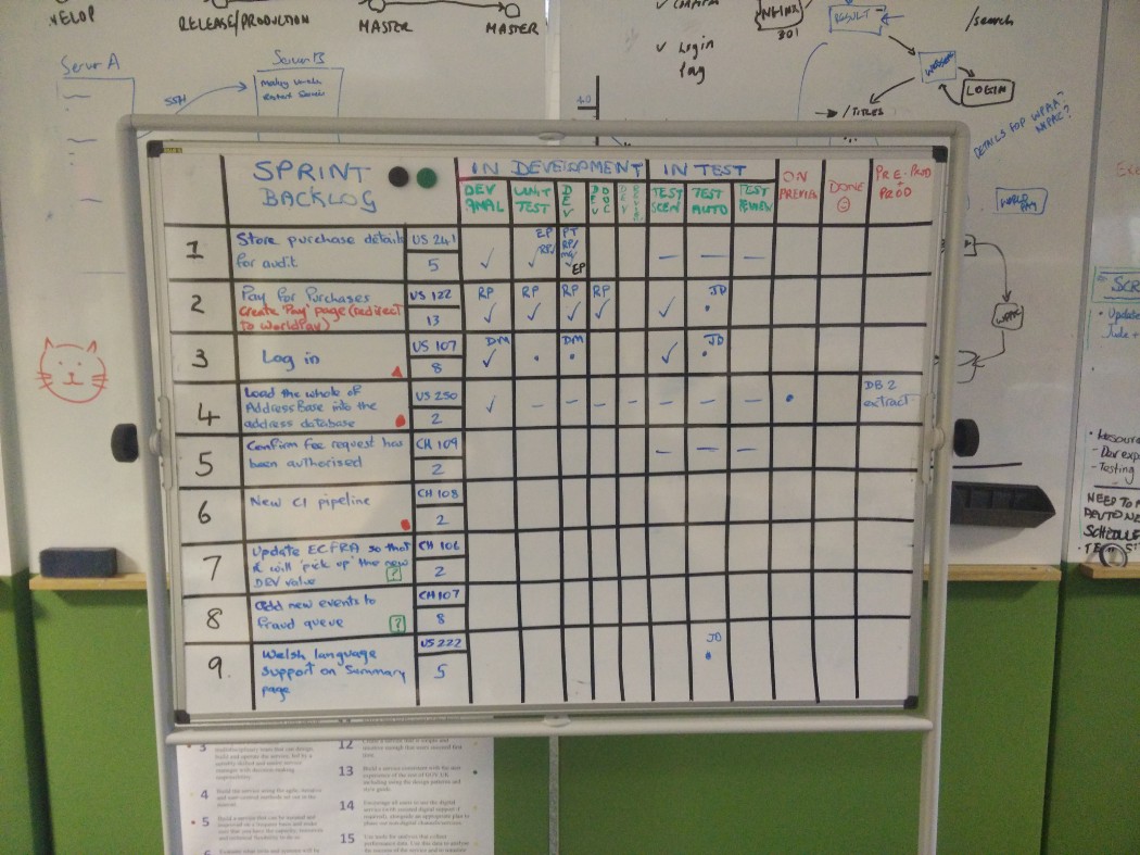
Its not my place to tell a team how to work, its my job to coach and mentor and point out why changes to work methods may be worth trying. The team agreed to try a new board after a particularly difficult sprint.
Board 2. The basic kanban board.
Next we tried a fairly basic kanban board with the intention of inspecting and adapting it as we identified our constraints.
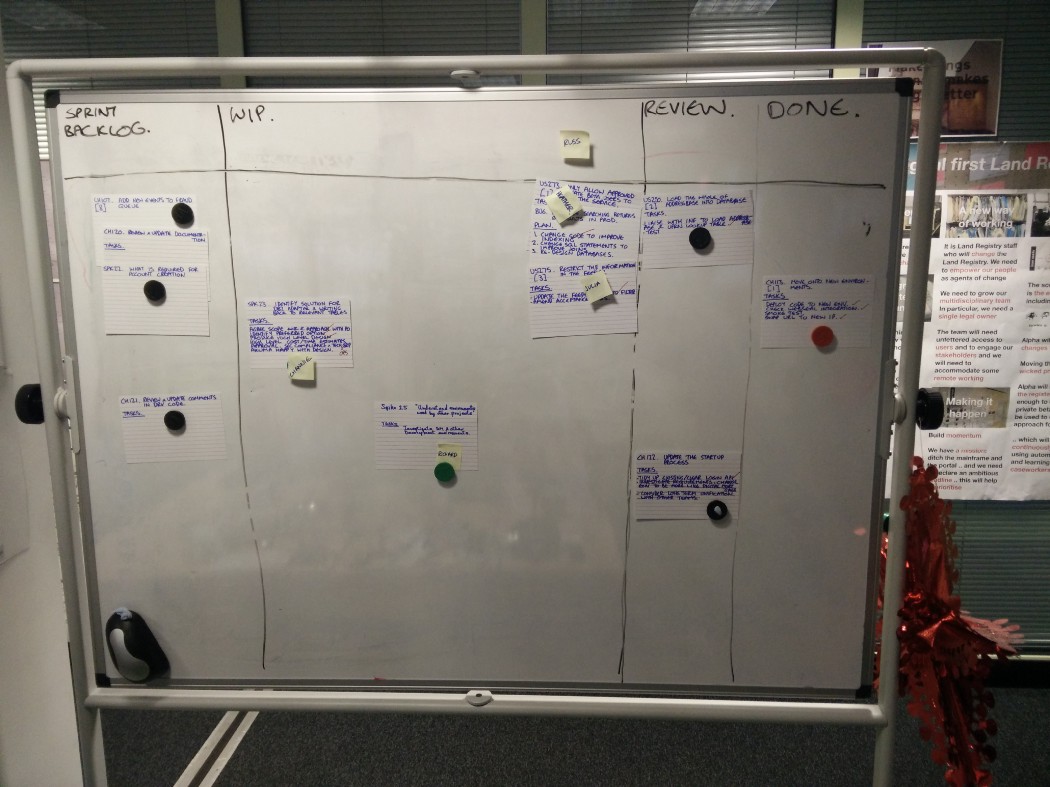
The basic kanban board had a few issues. It was easy to lose track of priority as cards moved from one column to the other. It also wasn’t always obvious when a card should move from one column to the next.
Crucially our team are co-located, the majority of the team are in one place but not everyone. We used pivotal tracker as the source of truth of what was going on with a story. The success of the physical board and its ease of use led to its own problem, the board was updated but often we were forgetting to update pivotal, leading to confusion.
Board 3. Detailed backlog board.
Horizontal lines were re-introduced to help keep better track of priority. Checklists above each column were also added to assist with decision making on whether the card was ready to be moved on in the flow. The board expanded physically too, a new mini board was added to the left where cards coming up for the next sprint were added to give a better heads up.
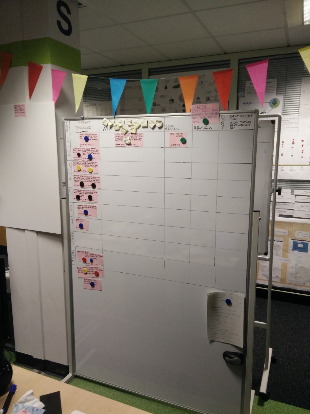
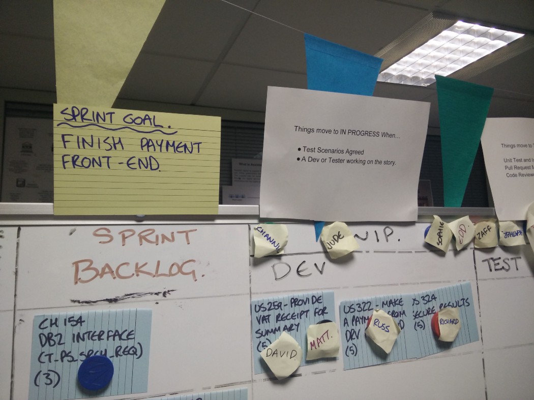
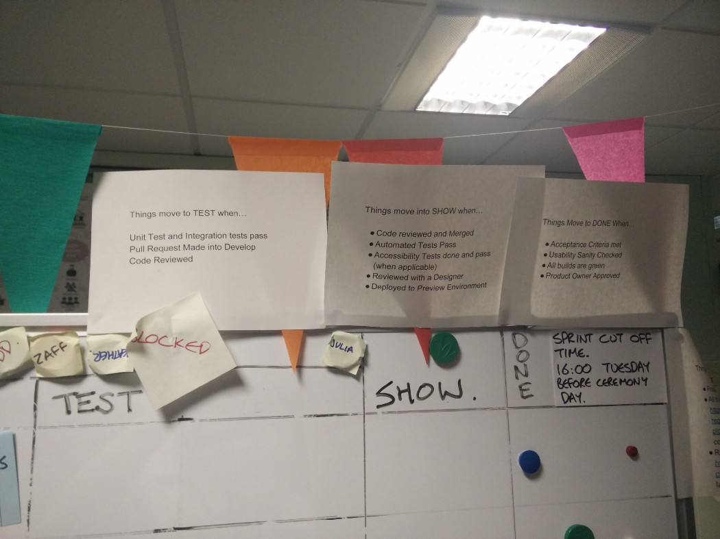
Board 3 helped with the priority issues. The re-addition of horizontal priority lines did lead to some concern that we were going back to the checklist board, however once the team saw cards continued to flow as with the simpler kanban board that was cleared up.
Board 3 helped provide more clarity but the problem with pivotal falling behind remained.
One crucial problem that all the boards had was that they focused on technical delivery and didn’t include user research and design. This sometimes led to confusion leading to differences between prototypes and production systems.
Similarly our delivery through to production is not yet continuous. We were signing stories off in our preview environment and then not tracking the work to get the story to production. The work was being done but it was hidden from our estimation for future sprints.
Board 4. Mapping the whole flow, is one board enough?
In order to further improve the board, I decided to whiteboard the end to end process of idea to production. I realised that if we wanted to we could split the flow into different boards.
- A board for user research and prototyping
- A standard sprint delivery board.
- A board to track production releases.
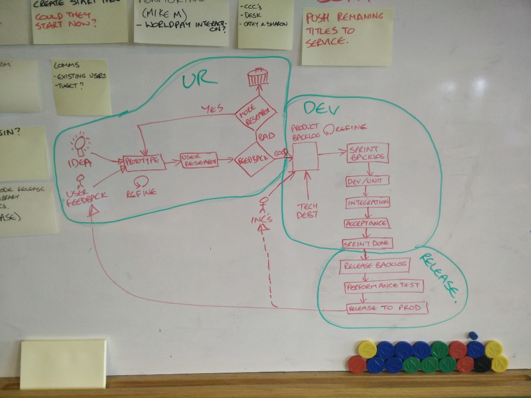
The flow diagram wasn’t met with universal appeal. There were concerns that it was silo’ing the team, it looked to waterfall’y. But it did stimulate a lot of debate about how we deliver things and our relationship between UR/Prototyping, Delivery and Release.
Eventually we settled on two boards. A UR/Design board aimed to be a few weeks ahead of the Delivery/Release board in any given sprint. We wanted to solve the pivotal/physical board issue so we switched to trello which gave the closest physical approximation of the flexibility of a physical board in my humble opinion.
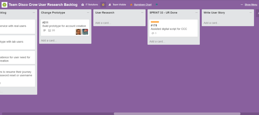
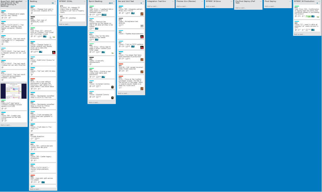
We have only been using the boards for one sprint so far, generally they have been well received but it’s early days. There have been a few issues migrating and refining stories in the move from pivotal to trello (not as easy as you might think, I recommend this tool from little blue monkey) and I’m sure some of the columns may change especially in the UR board which we haven’t really defined in this way before.
There are a few negatives to this board:
- We have the priority losing issue we had with board 2 back again. We have worked around it by creating a card with a list of the priorities in it for reference if anyone gets uncertain.
- Ideally we want to kill the release part of the flow, this needs to be automated as much as possible a-la Continuous Integration/Continuous Delivery. The fact that visualising the flow in this way helped us to identify and start to address this issue is a positive.
- I have a nagging feeling about the loss of the tangibility of a physical card, I cant put my figure on what it is but there is something tactile about owning something physical.
I would be interested in your views and experiences of visualising workflow, what has worked well what hasn’t. Thanks for reading.